Figma Screens
My role
Ran product discovery & definition workshops for a new product (short & long term car rental) for Spotawheel. Defined problem statement, product goals, product features & USPs, IA for product landing page, designed user flows and high-fidelity wireframes. Designed and conducted usability testing to understand how users interact with our design and identify problems they encounter and friction points.
Outcome
Webpages for Spotawheel GO product are now live. All feedback from user testing was incorporated in the designs.
Background
Spotawheel is a company that sells used cars based in Greece. Until recently customers could acquire a car from Spotawheel only through purchasing it. Spotawheel introduced an alternative way to purchase - the short and long term rental - under the name Spotawheel Go.
Project Overview
The project deliverables for the new product were:
- To design a landing page for Spotawheel GO
- To design a new version of the car page for Spotawheel GO
- To test both designs with users and get their feedback

Background and Research
Primary Research
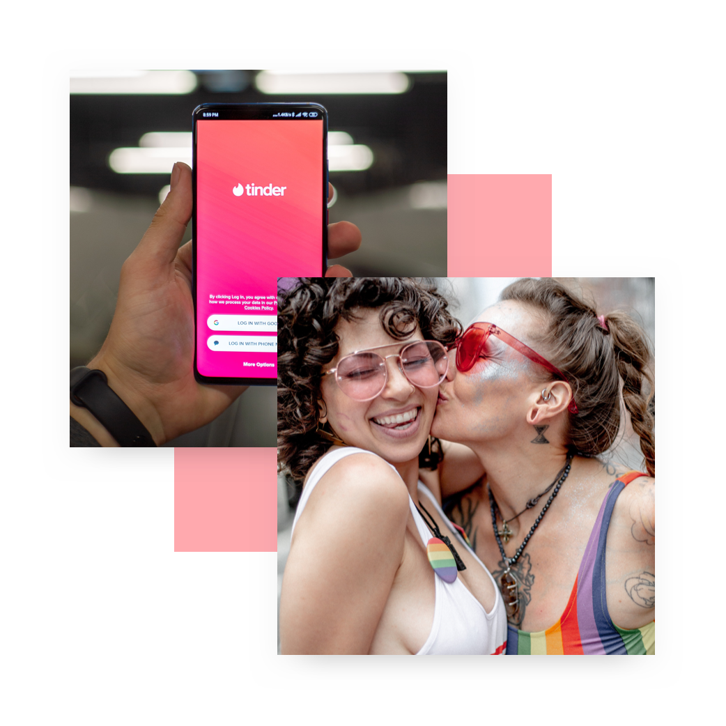
I started a few interviews with fellow queer friends but I needed more information so I researched through relevant groups such as the subreddit r/polyamory and used Instagram and meme culture to find my users; later I added TikTok to my search to cover a wider demographic between Gen Z and Millennials.
I reached out to many queer Instagram accounts, a few accepted to collaborate with me, and post some of my interview and survey questions to their combined following of 180,000.
Using surveys, story responses, and post comments we received close to 10,000 responses! The need for a better dating app was so pronounced in the queer community, especially more feminine of center and GNC folk.
Interviews
I chose interviews because they allow me to guide the users and gain more personal and qualitative insights.
Some Interview questions:
Introduction
- What they're looking for
- Their experience with dating appsRun-through of how they use their favorite dating app
Issues they may have with current
What their ideal dating app would offer
General Questions:
- What makes an app worth purchasing?
- How do you choose which apps to download?
- Do you ever leave reviews?
- Runthrough choosing an app from a random category
Secondary research
Competitive Analysis
With my extensive research data and the help of my newfound instagram community, I went through many different dating apps to create a comprehensive competitive analysis.
I focused on the onboarding process and profile set up as many of our issues stemmed from there.
Search for relevant stories
As I was searching for my users I was also looking for posts, shared experiences and more to gain a better perspective of the pain points users were facing.
Research roadblocks:
Bisexuals make up the majority of the queer community but often they're not publicly out so they tend to exclude themselves from queer spaces.
LGBTQ+ spaces are dominated by cis white male gay men, who already receive the most representation and resources and so are not the target audience for this redesign.
There isn't a single Lesbian bar/hangout spot in Los Angeles! This makes it incredibly difficult to meet WLW (Women Loving Women) in natural settings.
How do I narrow my search for gender non-conforming people when I have no idea how to find them?
Research Summary
Through research collaborations with queer instagram communities and interviews with select users, it became clear that lack of filtering options for couples, non-binary, and trans people is causing major frustrations.
I looked through other dating apps to see how they had solved this problem and found that okcupid has one of the better solutions but no app really fixed it all.
Next step of the process was to develop personas and user journeys to better understand exactly where these frustrations arise and to help me figure out how to provide a better solution.
To Summarize main Pain Points found:
Couples on queer women section
No option for seeing specific sexual orientations or gender identities
Gender non conforming people can only be seen when grouped into everyone
No option for reporting dudes that are on the lesbian section
Women don’t like making first move so they just collect matches
Women looking for threesomes with no info about their man cause they get more matches that way

Personas & Journey Maps

Personas
Based on the data gathered during research, I set up three personas. I referred to them throughout the entire product development process.
I included context, typical day, interests, personality, device, future goals and a scenario related to datings apps for each persona to increase empathy.
Note: Though I made a conscious effort to design for diversity, after a interview I realized the age and ability range in the personas is very limited. Hoping to work on this on another iteration!
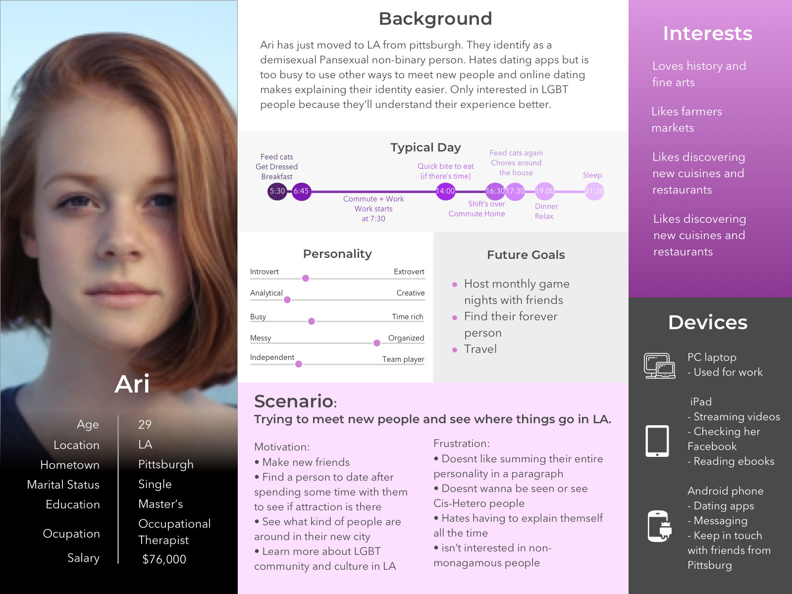
Ari
Demisexual, non-binary, Pansexual person, looking for friends and a long term relationship

Alex
Married, thinks he may be polyamorous. Looking for LGBT women to date per his wife’s request.
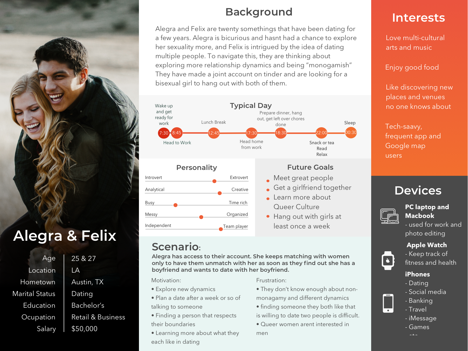
Felix and Allegra
Couple interested in dating women together. Looking for friends with benefits or a GF for both of them.
Customer Journey
To understand how our personas interact with the service I created a Customer Journey Map. Below is the Customer Journey map for our happy couple, Alegra and Felix.


Sketches to prototypes

Sketches and Wireframes
I usually start the design process with rapid paper sketches. This way I can iterate through many design options quickly.
I created low fidelity wireframes as digital versions of my paper sketches for testing purposes in the sketch app.
This allowed me to see what different sections in settings would look like so I could minimize wording and simplify settings for better readability.

UI Design
You can navigate the prototype above by clicking on the screen. Interactive elements will be highlighted briefly in blue on each screen.
Clickable prototype in Figma
What I changed:
Reduced use of vibrant color for highly sensitive users
Improved on-boarding's gender screen by adding non-binary and couple as options
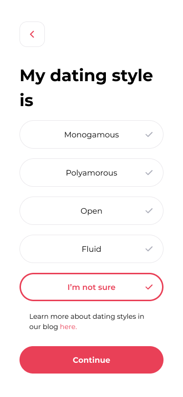
Added dating style options (e.g. polyamorous, monogamous, etc.)
Added 'looking for' screen (e.g. Long term dating, hook-ups, etc.)
Improved 'show me' screen by adding more inclusive options
Removed ambiguous premium buttons for basic users
Included a filtering button on the top right of the discovery page
Added distance to top left of profile cards
Added matches screen for more visual presentation of matched profiles
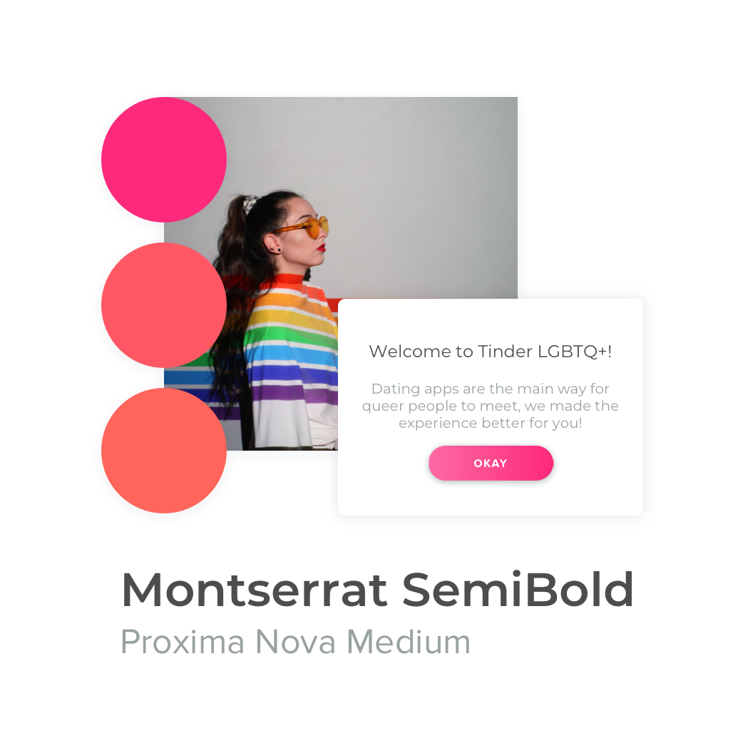
Visual Design
Once I tested out usability mishaps, I started designing the final screens. Originally I started building my prototype on sketch and invision. Later, I decided to switch to Figma where I used a UI kit to build the screens.
I followed tinder's pre-existing designs as much as possible, though I did try to improve some things.
I incorporated my design solutions mostly to on-boarding and filtering options, I also simplified the interface to ease navigation and maximize focus on the main features of the app.


User testing and feedback
User Testing
To work out the kinks for future iterations, I tested the prototype with a diverse but rather small sample of participants. I wanted to know how likely people of different demographics were to notice the changes without me pointing them out, something to note is that often cis hetero people were most likely to be confused by the new terminology and would suggest presence of a glossary.
I also realized that while my personas are ethnically diverse and cover a few archetypes of potential users, they lack variation in age and abilities.
With all this uncovered information regarding dating apps I've been wondering if implementing all these ideas may be better as a separate dating or meeting app focused on diversity, inclusion, and education in interpersonal connections of various types.
This would open space for educational workshops and collaborations with marriage and family therapists in the same way the flo app connects reproductive health professionals to individuals regarding their menstrual cycle.
29
screens
10K
Survey Responses
6
Iterations
Take Aways
I did accidentally get myself banned from tinder while making this case study... in order to experience and capture the on-boarding and improve it I had to create a second account (which violates the terms of tinder)
Having shown my proposed on-boarding to members of the queer community, I've received great feedback that non-binary options are no longer grouped into men or women, this created much discomfort and dysphoria for trans and non-binary users.
Introducing dating style also opens the conversation for non-monogamy and alternative relationship dynamics to be represented and filtered for best compatibility between matches.
I'm still fine-tuning this project as it is my passion project! I find interpersonal connections and mechanisms of attraction absolutely fascinating! Feel free to contact me here golbieazizi@gmail.com to chat about this project!
Thank you!
Drop me a message
Let's share ideas!